Friday, 23 April 2010
Notice
All posts below here are included in the links above which are there for easy navigation of the blog.


Wednesday, 21 April 2010
Rules and Regulations for use of Copyright Material
Any use of music in this film complies with 'Fair Dealing' under the 1988 Copyright Designs and Patents Act (UK), Sections 6(i) and 6(ii);
Fair dealing is a term used to describe some limited activities that are allowed without infringing copyright. Briefly these are as follows:
Section 6
i. Research and private study
Copying parts of a literary, dramatic, musical or artistic work or of a typographical arrangement of a published edition for the purpose of research or private study is allowed under the following conditions:
· The copy is made for the purposes of research or private study.
· The copy is made for non-commercial purposes.
· The source of the material is acknowledged.
· The person making the copy does not make copies of the material available for a number of people.
ii Instruction or examination
Copying parts of a literary, dramatic, musical or artistic work or a sound recording, film or broadcast for the purpose of instruction or examination is allowed under the following conditions:
· The copying is done by the student or the person giving instruction.
· The copying is not done via a reprographic process.
· The source of the material is acknowledged.
· The instruction is for a non-commercial purpose.
Progress Report - Editing part 2
Over the last couple of weeks my group has been editing the trailer for our coursework. After completing the initial cropping and ordering of the shots in order to get the correct continuity we then had to start matching the sound to it. This was all planned in the dual column script and so all we had to do now was create it and add it.
The first piece of sound was fairly easy as all we needed was the beat of a bass drum which we could then repeat at certain intervals throughout the clip. The second layer of sound was the dialogue. We recorded this in the recording studio last week with our actress. This stage caused a few more problems than expected. I was given the task of choosing the best takes of each line of dialogue and then breaking up the dialogue into lots of different sound files. I used Adobe Audition to do the editing on the dialogue.
 I had never used this software before and so it took a bit of time to get a feeling for it. We had recorded several takes of the script and so at first I tried to chose the best take of each line and match them together, however what I soon came to realise is that the volume levels and clarity were different on each take. Due to this I scrapped that method and chose the complete take that I thought sounded best and then went through the process of braking that up into the 20 seperate files we needed.
Once the audio files had been separated I then gave them to our editor to put on the trailer edit on Adobe Premiere. They all sounded ok and matched to their planned shots pretty well.
 The only problem we found was that as the last two lines of dialogue are said in a piece to camera by the actress rather than in the recording studio they sounded different. In fact the quality of the one where she talked to the camera was very poor and so we arranged a re-shoot of this shot as soon as possible with a camera and a good quality microphone in order to get the two sections to match.
The re-shoot didn't take long and with the better quality audio we placed this new clip onto the trailer and the continuity in sound quality was much better. The final thing we had to do was put the non-diegetic music onto the trailer.
 We were originally told we could not use pre-recorded music and so created our own. We used a keyboard in the audio suite just to create a gradually increasing tone to run throughout the trailer. Once it was placed on Adobe Premiere with the rest of the trailer we merely faded it from start to finish so that it would build towards a climax which in our case was a final beat of the bass drum right at the end of the music. This is all planned to work towards increasing the tension throughout the trialer.
The first piece of sound was fairly easy as all we needed was the beat of a bass drum which we could then repeat at certain intervals throughout the clip. The second layer of sound was the dialogue. We recorded this in the recording studio last week with our actress. This stage caused a few more problems than expected. I was given the task of choosing the best takes of each line of dialogue and then breaking up the dialogue into lots of different sound files. I used Adobe Audition to do the editing on the dialogue.

Once the audio files had been separated I then gave them to our editor to put on the trailer edit on Adobe Premiere. They all sounded ok and matched to their planned shots pretty well.

The re-shoot didn't take long and with the better quality audio we placed this new clip onto the trailer and the continuity in sound quality was much better. The final thing we had to do was put the non-diegetic music onto the trailer.

Progress Report - Radio Advert Editing
The radio editing stage has been a fairly quick and easy process. We used Adobe Audition for this task which I had already used before in order to edit the voiceover for the trailer. This meant that when I had to edit the trailer voice over I was already familiar with the software and could get things done fairly quickly. First I had to split all the takes of the script into separate sound files and then choose the ones that the group felt were best. There were two sections to this with the first being the film’s main male protagonist’s speech and then a narrator for the legal blurb at the end. Therefore I saved the files with the different voice artists names and then 1a, 1b, 2a etc. for the different takes. Keeping them well noted and ordered like this made the next part of the editing process a lot quicker.
The clips were chosen on both sound quality and appropriateness of the tone of the voice artist. We were looking for a serious tone in the actor’s voice in order to meet the codes and conventions of thrillers. I learnt from my research into the ‘Tell No One’ trailer that the tone and tempo of speech on a thriller’s radio advert are important sign systems for the audience. Having a slow tempo with a serious tone provides a kind of suspense and tension which is precisely what we were looking for. Once they had been chosen I simply had to put the two segments onto Adobe Audition and put them together. This software is pretty easy to use and has definitely helped me to create a good quality product in this case.
After completing the main two segments of speech we had to add a couple of sound effects. It was decided at the planning stage that we would not use music on the radio advert as we felt the silence would provide the tension we desired. For the sound effects we decided to include the bass drum beat that we had used in the trailer at the beginning and end of the advert. This provides some continuity in the campaign by linking the two products. We also decided to use a heartbeat on the radio advert. This sound effect was not on the trailer but we decided to run it as an undertone to the riddle as ideologically hearing a heartbeat is associated with fear or tension and hence it fits the thriller codes and conventions.
Tuesday, 20 April 2010
Progress Report - Website Production (part 2)
After talking with my lecturer about my original website front page layout I decided to make some changes. The layout was almost too organised with an item top left (title and date), bottom left (photo of actors), top right (tagline) and bottom right (Weymouth College sign). Websites rarely seem follow this perfectly synchronised format unless placing their content in the centre of the screen. Also the idea of choas fits the thriller genre more than that of organisation. The final influencing factor which brought me to the decision of chsnging my layout was the focus of my campaign.
In the marketing of a film, companies will generally either use the title or the date as main branding tools. I had originally planned on using the title hence the larger font on my first draft. In my revised version I have made the date the largest font size and the title the second largest. I have also placed the date in the middle of the screen to show its importance. I then moved the title to the top centre and made it the second largest font size. This shift in focus from the title to the date comes from the trailer and radio advert having some prominent focus on the date being the 21.6.10 (a.k.a. Midsummer's Day).

I also decided to disorganise the lettering and move the tagline in to an off central position in order to provide the feel of chaos. I still wanted it to look professional but feel this layout is more appropriate for a film of the thriller genre.
Finally once all of the main production was completed I decided to make it a real webpage. I placed my front page onto 'Macromedia Dreamweaver' and then put it into a webpage. Following this I had to 'print screen' the top and bottom of the of the page as it needed to scroll down and then put them back together on 'Photoshop'. It was for this stage that I had faded the main image of the college building out using the feathering tool on Photoshop previously as now it blends into the black background used on Dreamweaver and looks professionally done, like it fits.

Website Front Page - Final Draft
This is the final draft of the website front page before I put it onto Macromedia Dreamweaver so that it was in a proper web format.


Friday, 9 April 2010
Main Evaluation
My main focus throughout this year’s A2 media coursework has been on progressing from last year’s A/S coursework. This year I had to create a viral campaign for a film which included a trailer, magazine cover, website front page and radio advertisement. Last year I just had to create the opening sequence of a film so radio, magazines and websites were new areas for me.
In what ways does your media product use, develop or challenge forms and conventions of real media products?
With the experience gained from my A/S coursework I decided to predominantly use the current forms and conventions for teaser trailers, magazine covers, website front pages and radio adverts.
A/S main exercise - opening sequence of a film
I learnt from last year’s coursework that using current forms and conventions helps in creating a product which the audience can fully understand. The fact that I had already created two video productions last year was a great help in each stage of the trailer’s production. I analysed the teaser trailers for ‘Cloverfield’ (Matt Reeves, 2008), ‘Inception’ (Christopher Nolan, 2010) and ‘Inglourious Basterds’ (Quentin Tarentino, 2009) in order to get a full understanding of the forms and conventions they used. I wanted to create a trailer that set up an interesting enigma for the audience to decipher and learning from three professionally produced teaser trailers was one of the best ways to do this. Probably the best use of the enigmatic style was shown in the ‘Cloverfield’ teaser trailer and proof of this came from the massive online buzz that it initiated.
The main problems that arise from trying to use the conventions of real media products are lack of time, money and expertise. Due to this, creativity and initiative became vital parts of the project. The titles were kept simple so that a professional look was maintained and they were placed beginning and end as my research advised this.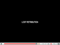 For the structure of the trailer I decided to follow ‘Inglourious Basterds’ example with regards to having dialogue run throughout the trailer and then matching the visual elements to this. I then attained my music idea from ‘Inception’ by having an ever increasing tone run throughout and a series of bass drum beats at specific intervals to imitate a slow heartbeat both of which help to create tension. ‘Cloverfield’ provided some camerawork ideas such as point of view shots in order to engage the audience fully with the text. By using a mix of the forms and conventions from real media products my teaser trailer has a structure that the audience should understand.
The forms and conventions that go towards creating an enigma were drawn from all my example texts with my main conclusion being that less is more. Within the trailer my group decided not to disclose the identity of the main antagonist in order to ‘tease’ the audience. This technique has real world backing as it was also used by ‘Cloverfield’. Unlike ‘Cloverfield’ however and one of the ways in which we developed the forms and conventions of real
 media products was to imply the antagonist’s presence through point of view shots. As our film idea is a thriller forms and conventions dictated we had to develop tension and fear in order to attract our target audience. The elusion to the antagonist’s presence helps provide this alongside the music, bass drum and script. All of these elements were designed to start slow and build to a climax which ended with the camera and male protagonist colliding. Everything then stopped just to leave a shot of the female
 protagonist answering a question which was posed at the beginning in an enigmatic fashion. The trailer for ‘Inception’ is the best real world example of this technique I have from my research.
The research based style I used in the trailer I followed throughout all of my production pieces in order for real world forms and conventions to be a running theme. This helped me with one of the most important aspects of my viral campaign, to create four cohesive parts for a synergistic whole. If I had tried to challenge the forms and conventions of real media products it would have been difficult to organise each part of the campaign into an effective whole.
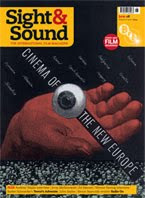 To identify the forms and conventions for my magazine cover I researched Empire and Sight & Sound as these are two of the biggest film magazines in Britain. I decided to base my cover on Empire as I felt their readership was most like my target audience. After analysing three Empire issue covers there were a variety of conventions both from Empire and thrillers which I identified and used. Empire’s conventions included the size of font correlating with the importance of the text, the colouring of the text having limited range so as not to overpower the picture, using a mid-shot photograph of the main character(s) as the focal point about which the text is placed and using right align, left align and centering depending on the text’s position on the page.
 Also Empire place the issue date and price in the dip of the ‘M’ of Empire and have the cover model’s head protrude into the lower half of the magazine title. These forms and conventions are part of Empire’s branding and are fairly general however there are some that vary depending on the film being promoted.
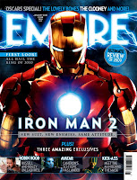
For example, they usually establish a theme which will dictate such things as colour schemes and font styles. The colour scheme for my film campaign was black and red. I made the film’s title a dark red and designed a background with a mixture of these two colours as part of the film’s branding process. I then used Photoshop to create a cloud effect which was to promote the chaos and disruption within the film.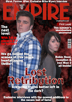 Thus some of the underlying features of the films plot and genre are in the magazine which should help to attract the target audience and link it to the other parts of the campaign. A good real world example of using the background colour and style as part of the branding comes from the Iron Man issue I researched.
I found creating the website front page more difficult than the magazine cover. This is because once a brand of magazine has been chosen you have a template already laid out which just requires a different interpretation, whereas with websites there is no monthly issue to analyse. Due to this I relied heavily on my research. A few months ago I did some basic magazine research into five film websites, but more recently I did an in depth textual analysis into the website for ‘A Nightmare on Elm Street’.
I identified and used some basic thriller codes and conventions from both sets of research such as having a dark colour scheme. My background was black and the main picture on the page was taken at night. Simplicity was a major part of A Nightmare on Elm Street’s website as they merely had a picture, the title, a box for the trailer, links and credits/legal blurb. As part of my quest to adhere to the forms and conventions where possible I also included these elements on my website front page. However I included a photograph of the protagonists rather than antagonist as part of the enigma within the viral campaign was to not give away the identity of the antagonist. Other websites which used this approach include ‘The Dark Knight’, ‘The Matrix’ and ‘The Twilight Saga: Eclipse’.
Other film website forms and conventions I followed include the main picture being of a focal
 point from the film, using thin grey lettering for the credits, including a BBFC classification certificate and including links to social networking sites. This last one is a more recent convention and it has been developed with the viral campaign style as film
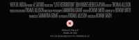 companies have realised the below the line marketing potential of the social networking sites. Most of the film websites I researched included links to fan pages on some or all of the major social networking sites. I also used Macromedia Dreamweaver in order to put my website front page onto an actual internet page.
 This makes it look like an actual working website and as far as forms and conventions go it really finalises the website.
The final product I had to create for the viral campaign was a radio advertisement. Before the coursework I’d had no previous experience at radio so I first had to learn the forms and conventions of this particular media. As I was screen writer for the trailer I also assumed the equivalent role on this task which meant writing the script both for dialogue and music/sound effects was my responsibility. My lecturer explained to me that like with video it still via semiotics but just without the visual element. I carried out a detailed textual analysis for the ‘Tell No One’ radio advert in order to better inform my product.
My main focus whilst writing the dialogue for the radio script was to keep the enigmatic theme that was running throughout the campaign. My first attempt was based on my Tell No One analysis which was to use a narrator to just give the name, date and form of release and tag line of the film with some diegetic sound from the trailer such as screams running as an undertone. This is a very conventional form for radio adverts but it was later decided this may be stereotypical to the point where it was boring and unimaginative.
Due to this I decided to develop the conventions and write a type of riddle for the male protagonist to say and just use a narrator for the date and form of release and the age classification at the end. Riddles are a great way to create enigmas and so this fits in with the campaign style, I eluded to the date of release and genre of the film within the riddle in order give the audience a starting point from which to try and solve the riddle (by watching the film). Also as part of the radio forms and conventions for thriller film adverts I used voice artists that I believed had a serious tone in order to the tense thriller feel. For the narrators section I used some conventions such as the form of release being given and the age classification being read quickly at the end but I also developed some in so far as the date was not given in the usual fashion of numbers but by the name of the day (Midsummer’s Day) as this was one of the parts of the riddle and so continued the enigma through to the end of the advert.
Alongside the dialogue for the trailer my group also used a couple of sound effects. We included the beat of a bass drum at the beginning and end of the radio advert in order to link this part of the campaign with the trailer due to use of the same sound in the trailer. A new sound effect we used solely in the radio advert however was the beat of a heartbeat. This was placed as an undertone to the first speaking part of the trailer and we set it to fade in. This definately conforms to the conventions of thrillers as a loud heartbeat is normally associated with tension, adrenaline and fear.
How effective is the combination of your main product and ancillary texts?
I have tried hard throughout the advanced production to create a synergistic relationship between all the parts of my campaign. The trailer is the focal point of the campaign as this is where the audience is most able to get a feel for the film’s content and nature. Several key elements from the trailer were also used in the other parts of the campaign in order to create continuity. For example, the release date is a big part of the campaign and it is mentioned in the trailer, on the website and on the radio advert but as it is not part of Empire’s codes and conventions I did not include it on my magazine cover.
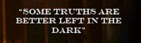

The tag line ‘Some truths are better left in the dark’ is also an important part of the branding. It is said at the end of the trailer and I included it both on my website and magazine cover though on the magazine cover I modified it into a question for enigmatic purposes.
The title was a contentious point within our group. We were not sure whether to follow Cloverfield’s lead by not including it anywhere in the campaign so as to try and create an online buzz, or to follow the conventional method by having it as one of the main branding tools. When we originally designed the trailer we left the title off due to the Cloverfield research however as my partners and I began to create our other products we decided this was not right for our campaign. The basis of Cloverfield being able to not include the title was the fact that it had a fairly well known director
 which they could use for branding instead. As I was the director and clearly don’t have any past films or fan base we could not effectively execute the same strategy. We decided therefore to use the title ‘Lost Retribution’ and date ‘21/06/10’ alongside the tag line as the main branding tools.
In this coursework the magazine and website were individual tasks whilst the trailer and radio advert were group tasks and in my complete campaign I had at least two of the three main branding tools mentioned above in each of my four products. A couple of other areas in which the separate parts of the campaign were designed to link include the use of a base drum in both the trailer and radio advert and placing the main protagonists in the trailer, on my magazine cover and on my website front page. The fact that all four elements of the campaign will be available online also adds to the effective combination of my main product and the ancillary texts. Using all of the techniques mentioned above I feel I have created a synergistic campaign in which each part works towards a greater whole.
How did you use new media technologies in the construction and research, planning and evaluation stages?
One of the main progressions from the A/S to the A2 coursework has been the extensive use of new media technology in the planning and research stages. All of my coursework this year is available to view online whereas last year a fair amount was paper based. This was done through a combination of the web 2.0 sites ‘Blogger’ and ‘Google Documents’ which allowed me to upload and store all my work on the web from the initial ideas through to the evaluation. Any work that was completed on paper such as the storyboards and initial ideas drafts were then scanned into the computer so that they could also be uploaded onto either Blogger or Google Documents. Google Documents was mainly used for the group tasks as we needed to be able to share the work between all group members. Therefore by using this online storage system we could all access and edit any of the paperwork and then merely had to put the link into a page on Blogger so that it could all be accessed with
 the rest of the coursework. I used Blogger for my individual pieces as it looks more professional than Google Documents and it allows me to add links, pictures and videos more easily.
The Blogger site was set up very early on in this academic year and my lecturer has been getting myself and the rest of the group to continually add to it as the year has gone on. Therefore the blog provides a view of the process I went through to complete this coursework in a way that is organised and looks professional. Making it look professional has been a conscious effort as I didn’t want it to be filled with pages of just bland text. Therefore I have added pictures where appropriate, links to my sources and have even embedded ‘Youtube’ videos on it to support my research material.
During the research stage of my trailer I used Web 2.0 sites such as Youtube in order to access examples of real world texts to better inform my own production. I also used the internet as part of my research into magazines, websites and radio adverts so new media technologies have played a big part in my coursework this year.
Though I used new media for the production stage last year this also has been developed greatly in the progression from A/S to A2. For shooting the trailer we used one of the college’s digital video cameras which were new compared to last year. The
 editing software we used for the trailer ‘Adobe Premiere’ was also new to me as last year we had used ‘Window’s Movie Maker’. Therefore, though both years’ coursework productions were produced totally with new media technology this year that technology was more advanced and in depth allowing me and my group to create better quality products. As for the magazine, website and radio advert all the new media used on these was completely new to me at the start of the year.
 I have used 'Photoshop'extensively this year during the production and editing stages of both the magazine and website tasks and it has allowed me to create complex and professional looking products. It enabled me to use several layers of images and text for both the magazine and website. This meant I could create 'fictional' scenes which best create the audience response desired and follow the industry codes and conventions. For the website front page I also used 'Macromedia Dreamweaver'.
 Though I didn't have to create a working website with multiple pages in order to make my web page as authentic as possible I used Dreamweaver to put my web page into an internet page. I then used print screen twice and cut the page back together on Photoshop as an image. This and many other coursework tasks were only possible due to the new media technology available to me during this coursework. For the radio advert we used the

audio suite at college to record the dialogue and then used ‘Adobe Audition’ for the editing. Having high quality new media equipment and software such as that mentioned above available really broadened the horizon on what was possible at each stage of the coursework.
It is fair to say that I have used a variety of new media technology over the four tasks this year to carry out a wide range of jobs. Learning how to properly harness these technologies has greatly advanced the quality of my products this year compared to the A/S coursework. Keeping it all digital also allows easy access for my self, my group, my lecturer and the potential audience which is definitely the way it is being done in the real world environment these days.
Audience Feedback
What have you learned from your audience feedback?

Once all the products for my campaign were completed I arranged for a group of four of my college peers who were familiar with cinematic campaigns being themselves regular cinema goers to look through them and provide me with some feedback. These people were not from my media class as I was conscious their feedback may be biased or that they would not look at the products in the same way the audience normally would. Using people my age was appropriate because they fall directly into the age bracket for the target audience of my film. After I got the feedback I went through it to find the more relevant comments with something on each product and then analysed them.
The first audience member said they, "...feel the campaign as a whole links well though there is less connection between the radio advert and the other three products". They also went on to say that, "The trailer reminds me of other thriller trailers I've seen though it didn't always seem to make sense". I can understand where the comment on the radio advert was stemmed from as we did use a slightly more unconventional approach on this product. Though I do feel we linked it to the campaign I will be more conscious in the future about any mixture of conventional and unconventional approaches within a campaign. As for the comment on the trailer I again see where they're coming from but I wouldn't say I'd view it as a problem. Trailers often don't run in a continuous fashion and particularly in thrillers in order to set up an enigma completely logical narrative structures are not always the best method. Due to this particular piece of feedback
My second audience member particularly liked the magazine cover saying it "looks authentic" and they could "imagine in it in a shop". This feedback is really positive and shows that I have done what I set out to do which was make professional looking products. In terms of the campaign as a whole they said it "all of the products give the feel of a thriller and it seems like the type of film I'd be interested in". Like the last comment this shows I have achieved one of the main things I set out to do which was create a campaign that would attract the target audience to the film.
The third audience member gave mixed reviews. They thought "the products look quite professional" and they particularly liked "the fact that the website is in a browser as it makes me feel like I could just go on and use it". However, they said, "I didn't feel as much tension when watching the trailer as I normally would for a thriller movie as there wasn't a great sense of danger." We made our trailer according to the BBFC's guidelines for a 12A so that it could be aired in more places but the restrictions on content associated with this could also have affected the tension. The film itself would have been rated a 15 and so in the future I would definitely consider whether by restricting the content in the trailer I am actually moving away from my target audience.
My final audience member said, "I like the professional feel about the campaign and particularly the tag line as it makes me want to know what the 'truth' is". This piece of feedback shows the enigmatic style of the campaign does work which should entice people to go and watch the film. They also said, "The products work well together and give me a good idea on what type of film it is but I would normally want to know more about the film's plot before deciding whether or not to see it." I think this shows that there is a form of synergistic relationship working between the campaign's products and the extra information would probably have been available on the website if it had been fully functioning or in the magazine article. I couldn't help this point as I didn't have to create the full products but if I were to ever create a real campaign I would make sure enough information on the film was available.
Conclusion
In conclusion I feel my products have achieved their purpose. The trailer includes appropriate mise-en-scene, a variety of shots and sound which all work towards building tension and setting up an enigma. My magazine cover follows Empire's codes and conventions whilst also effectively marketing the film by using some of the campaign's branding tools. The website also effectively markets the film by use of these branding elements whilst also providing the audience with a way of interacting with the film in a different way. Finally the radio advert uses the riddle to create tension and an enigma whilst also giving the audience information on where to see the film. In this way the four elements work together synergistically to create a hopefully successful viral campaign which would influence the target audience to watch the film.
In what ways does your media product use, develop or challenge forms and conventions of real media products?
With the experience gained from my A/S coursework I decided to predominantly use the current forms and conventions for teaser trailers, magazine covers, website front pages and radio adverts.
A/S main exercise - opening sequence of a film
I learnt from last year’s coursework that using current forms and conventions helps in creating a product which the audience can fully understand. The fact that I had already created two video productions last year was a great help in each stage of the trailer’s production. I analysed the teaser trailers for ‘Cloverfield’ (Matt Reeves, 2008), ‘Inception’ (Christopher Nolan, 2010) and ‘Inglourious Basterds’ (Quentin Tarentino, 2009) in order to get a full understanding of the forms and conventions they used. I wanted to create a trailer that set up an interesting enigma for the audience to decipher and learning from three professionally produced teaser trailers was one of the best ways to do this. Probably the best use of the enigmatic style was shown in the ‘Cloverfield’ teaser trailer and proof of this came from the massive online buzz that it initiated.
The main problems that arise from trying to use the conventions of real media products are lack of time, money and expertise. Due to this, creativity and initiative became vital parts of the project. The titles were kept simple so that a professional look was maintained and they were placed beginning and end as my research advised this.
 For the structure of the trailer I decided to follow ‘Inglourious Basterds’ example with regards to having dialogue run throughout the trailer and then matching the visual elements to this. I then attained my music idea from ‘Inception’ by having an ever increasing tone run throughout and a series of bass drum beats at specific intervals to imitate a slow heartbeat both of which help to create tension. ‘Cloverfield’ provided some camerawork ideas such as point of view shots in order to engage the audience fully with the text. By using a mix of the forms and conventions from real media products my teaser trailer has a structure that the audience should understand.
The forms and conventions that go towards creating an enigma were drawn from all my example texts with my main conclusion being that less is more. Within the trailer my group decided not to disclose the identity of the main antagonist in order to ‘tease’ the audience. This technique has real world backing as it was also used by ‘Cloverfield’. Unlike ‘Cloverfield’ however and one of the ways in which we developed the forms and conventions of real


The research based style I used in the trailer I followed throughout all of my production pieces in order for real world forms and conventions to be a running theme. This helped me with one of the most important aspects of my viral campaign, to create four cohesive parts for a synergistic whole. If I had tried to challenge the forms and conventions of real media products it would have been difficult to organise each part of the campaign into an effective whole.
 To identify the forms and conventions for my magazine cover I researched Empire and Sight & Sound as these are two of the biggest film magazines in Britain. I decided to base my cover on Empire as I felt their readership was most like my target audience. After analysing three Empire issue covers there were a variety of conventions both from Empire and thrillers which I identified and used. Empire’s conventions included the size of font correlating with the importance of the text, the colouring of the text having limited range so as not to overpower the picture, using a mid-shot photograph of the main character(s) as the focal point about which the text is placed and using right align, left align and centering depending on the text’s position on the page.
 Also Empire place the issue date and price in the dip of the ‘M’ of Empire and have the cover model’s head protrude into the lower half of the magazine title. These forms and conventions are part of Empire’s branding and are fairly general however there are some that vary depending on the film being promoted.
For example, they usually establish a theme which will dictate such things as colour schemes and font styles. The colour scheme for my film campaign was black and red. I made the film’s title a dark red and designed a background with a mixture of these two colours as part of the film’s branding process. I then used Photoshop to create a cloud effect which was to promote the chaos and disruption within the film.
 Thus some of the underlying features of the films plot and genre are in the magazine which should help to attract the target audience and link it to the other parts of the campaign. A good real world example of using the background colour and style as part of the branding comes from the Iron Man issue I researched.
I found creating the website front page more difficult than the magazine cover. This is because once a brand of magazine has been chosen you have a template already laid out which just requires a different interpretation, whereas with websites there is no monthly issue to analyse. Due to this I relied heavily on my research. A few months ago I did some basic magazine research into five film websites, but more recently I did an in depth textual analysis into the website for ‘A Nightmare on Elm Street’.
I identified and used some basic thriller codes and conventions from both sets of research such as having a dark colour scheme. My background was black and the main picture on the page was taken at night. Simplicity was a major part of A Nightmare on Elm Street’s website as they merely had a picture, the title, a box for the trailer, links and credits/legal blurb. As part of my quest to adhere to the forms and conventions where possible I also included these elements on my website front page. However I included a photograph of the protagonists rather than antagonist as part of the enigma within the viral campaign was to not give away the identity of the antagonist. Other websites which used this approach include ‘The Dark Knight’, ‘The Matrix’ and ‘The Twilight Saga: Eclipse’.
Other film website forms and conventions I followed include the main picture being of a focal
 companies have realised the below the line marketing potential of the social networking sites. Most of the film websites I researched included links to fan pages on some or all of the major social networking sites. I also used Macromedia Dreamweaver in order to put my website front page onto an actual internet page.
The final product I had to create for the viral campaign was a radio advertisement. Before the coursework I’d had no previous experience at radio so I first had to learn the forms and conventions of this particular media. As I was screen writer for the trailer I also assumed the equivalent role on this task which meant writing the script both for dialogue and music/sound effects was my responsibility. My lecturer explained to me that like with video it still via semiotics but just without the visual element. I carried out a detailed textual analysis for the ‘Tell No One’ radio advert in order to better inform my product.
My main focus whilst writing the dialogue for the radio script was to keep the enigmatic theme that was running throughout the campaign. My first attempt was based on my Tell No One analysis which was to use a narrator to just give the name, date and form of release and tag line of the film with some diegetic sound from the trailer such as screams running as an undertone. This is a very conventional form for radio adverts but it was later decided this may be stereotypical to the point where it was boring and unimaginative.
Due to this I decided to develop the conventions and write a type of riddle for the male protagonist to say and just use a narrator for the date and form of release and the age classification at the end. Riddles are a great way to create enigmas and so this fits in with the campaign style, I eluded to the date of release and genre of the film within the riddle in order give the audience a starting point from which to try and solve the riddle (by watching the film). Also as part of the radio forms and conventions for thriller film adverts I used voice artists that I believed had a serious tone in order to the tense thriller feel. For the narrators section I used some conventions such as the form of release being given and the age classification being read quickly at the end but I also developed some in so far as the date was not given in the usual fashion of numbers but by the name of the day (Midsummer’s Day) as this was one of the parts of the riddle and so continued the enigma through to the end of the advert.
Alongside the dialogue for the trailer my group also used a couple of sound effects. We included the beat of a bass drum at the beginning and end of the radio advert in order to link this part of the campaign with the trailer due to use of the same sound in the trailer. A new sound effect we used solely in the radio advert however was the beat of a heartbeat. This was placed as an undertone to the first speaking part of the trailer and we set it to fade in. This definately conforms to the conventions of thrillers as a loud heartbeat is normally associated with tension, adrenaline and fear.
How effective is the combination of your main product and ancillary texts?
I have tried hard throughout the advanced production to create a synergistic relationship between all the parts of my campaign. The trailer is the focal point of the campaign as this is where the audience is most able to get a feel for the film’s content and nature. Several key elements from the trailer were also used in the other parts of the campaign in order to create continuity. For example, the release date is a big part of the campaign and it is mentioned in the trailer, on the website and on the radio advert but as it is not part of Empire’s codes and conventions I did not include it on my magazine cover.

The tag line ‘Some truths are better left in the dark’ is also an important part of the branding. It is said at the end of the trailer and I included it both on my website and magazine cover though on the magazine cover I modified it into a question for enigmatic purposes.
The title was a contentious point within our group. We were not sure whether to follow Cloverfield’s lead by not including it anywhere in the campaign so as to try and create an online buzz, or to follow the conventional method by having it as one of the main branding tools. When we originally designed the trailer we left the title off due to the Cloverfield research however as my partners and I began to create our other products we decided this was not right for our campaign. The basis of Cloverfield being able to not include the title was the fact that it had a fairly well known director

In this coursework the magazine and website were individual tasks whilst the trailer and radio advert were group tasks and in my complete campaign I had at least two of the three main branding tools mentioned above in each of my four products. A couple of other areas in which the separate parts of the campaign were designed to link include the use of a base drum in both the trailer and radio advert and placing the main protagonists in the trailer, on my magazine cover and on my website front page. The fact that all four elements of the campaign will be available online also adds to the effective combination of my main product and the ancillary texts. Using all of the techniques mentioned above I feel I have created a synergistic campaign in which each part works towards a greater whole.
How did you use new media technologies in the construction and research, planning and evaluation stages?
One of the main progressions from the A/S to the A2 coursework has been the extensive use of new media technology in the planning and research stages. All of my coursework this year is available to view online whereas last year a fair amount was paper based. This was done through a combination of the web 2.0 sites ‘Blogger’ and ‘Google Documents’ which allowed me to upload and store all my work on the web from the initial
 the rest of the coursework. I used Blogger for my individual pieces as it looks more professional than Google Documents and it allows me to add links, pictures and videos more easily.
 The Blogger site was set up very early on in this academic year and my lecturer has been getting myself and the rest of the group to continually add to it as the year has gone on. Therefore the blog provides a view of the process I went through to complete this coursework in a way that is organised and looks professional. Making it look professional has been a conscious effort as I didn’t want it to be filled with pages of just bland text. Therefore I have added pictures where appropriate, links to my sources and
 have even embedded ‘Youtube’ videos on it to support my research material.
During the research stage of my trailer I used Web 2.0 sites such as Youtube in order to access examples of real world texts to better inform my own production. I also used the internet as part of my research into magazines, websites and radio adverts so new media technologies have played a big part in my coursework this year.
Though I used new media for the production stage last year this also has been developed greatly in the progression from A/S to A2. For shooting the trailer we used one of the college’s digital video cameras which were new compared to last year. The
 editing software we used for the trailer ‘Adobe Premiere’ was also new to me as last year we had used ‘Window’s Movie Maker’. Therefore, though both years’ coursework productions were produced totally with new media technology this year that technology was more advanced and in depth allowing me and my group to create better quality products. As for the magazine, website and radio advert all the new media used on these was completely new to me at the start of the year.
 Though I didn't have to create a working website with multiple pages in order to make my web page as authentic as possible I used Dreamweaver to put my web page into an internet page. I then used print screen twice and cut the page back together on Photoshop as an image. This and many other coursework tasks were only possible due to the new media technology available to me during this coursework. For the radio advert we used the
audio suite at college to record the dialogue and then used ‘Adobe Audition’ for the editing. Having high quality new media equipment and software such as that mentioned above available really broadened the horizon on what was possible at each stage of the coursework.
It is fair to say that I have used a variety of new media technology over the four tasks this year to carry out a wide range of jobs. Learning how to properly harness these technologies has greatly advanced the quality of my products this year compared to the A/S coursework. Keeping it all digital also allows easy access for my self, my group, my lecturer and the potential audience which is definitely the way it is being done in the real world environment these days.
Audience Feedback
What have you learned from your audience feedback?

The first audience member said they, "...feel the campaign as a whole links well though there is less connection between the radio advert and the other three products". They also went on to say that, "The trailer reminds me of other thriller trailers I've seen though it didn't always seem to make sense". I can understand where the comment on the radio advert was stemmed from as we did use a slightly more unconventional approach on this product. Though I do feel we linked it to the campaign I will be more conscious in the future about any mixture of conventional and unconventional approaches within a campaign. As for the comment on the trailer I again see where they're coming from but I wouldn't say I'd view it as a problem. Trailers often don't run in a continuous fashion and particularly in thrillers in order to set up an enigma completely logical narrative structures are not always the best method. Due to this particular piece of feedback
My second audience member particularly liked the magazine cover saying it "looks authentic" and they could "imagine in it in a shop". This feedback is really positive and shows that I have done what I set out to do which was make professional looking products. In terms of the campaign as a whole they said it "all of the products give the feel of a thriller and it seems like the type of film I'd be interested in". Like the last comment this shows I have achieved one of the main things I set out to do which was create a campaign that would attract the target audience to the film.
The third audience member gave mixed reviews. They thought "the products look quite professional" and they particularly liked "the fact that the website is in a browser as it makes me feel like I could just go on and use it". However, they said, "I didn't feel as much tension when watching the trailer as I normally would for a thriller movie as there wasn't a great sense of danger." We made our trailer according to the BBFC's guidelines for a 12A so that it could be aired in more places but the restrictions on content associated with this could also have affected the tension. The film itself would have been rated a 15 and so in the future I would definitely consider whether by restricting the content in the trailer I am actually moving away from my target audience.
My final audience member said, "I like the professional feel about the campaign and particularly the tag line as it makes me want to know what the 'truth' is". This piece of feedback shows the enigmatic style of the campaign does work which should entice people to go and watch the film. They also said, "The products work well together and give me a good idea on what type of film it is but I would normally want to know more about the film's plot before deciding whether or not to see it." I think this shows that there is a form of synergistic relationship working between the campaign's products and the extra information would probably have been available on the website if it had been fully functioning or in the magazine article. I couldn't help this point as I didn't have to create the full products but if I were to ever create a real campaign I would make sure enough information on the film was available.
Conclusion
In conclusion I feel my products have achieved their purpose. The trailer includes appropriate mise-en-scene, a variety of shots and sound which all work towards building tension and setting up an enigma. My magazine cover follows Empire's codes and conventions whilst also effectively marketing the film by using some of the campaign's branding tools. The website also effectively markets the film by use of these branding elements whilst also providing the audience with a way of interacting with the film in a different way. Finally the radio advert uses the riddle to create tension and an enigma whilst also giving the audience information on where to see the film. In this way the four elements work together synergistically to create a hopefully successful viral campaign which would influence the target audience to watch the film.
Subscribe to:
Posts (Atom)
