
Thursday, 25 March 2010

Advertising Industry Codes of Practice for Radio Broadcasting
Rowan Smith; 0121
Thomas Allison; 0051
Samantha Grant; 0081
In the same way that we needed to consider the Advertising Industry Codes of Practice for our trailer, we also need to consider these for our radio advert.
Reactions to different adverts can be vastly different , and so each station has to take into account different adverts, and make responsible judgements to make sure all the sensitive areas have been considered when choosing which adverts to broadcast. Research shows that a significant number of listeners, such as under 16 year olds, will be listening at certain times, for example in the mornings or school holidays. We will need to take all of the regulations into consideration when creating our radio advert.
With reference to ‘Good taste, decency and offence to public feeling’ on the BCAP Radio Advertising Code, we will need to consider:
a) offensive and profane language must be avoided;
b) salacious, violent or indecent themes, or sexual innuendo or stereotyping likely to cause serious or general offence, should be avoided;
c) the handling of films, plays, music tracks or websites with salacious, violent or sexual themes and/or titles requires careful consideration. Audio clips should portray the product’s true nature but clips containing bad language, sexual innuendo and/or gratuitous violence should normally be avoided;
In order to abide by these rules, we will make sure that any dialogue we use from our film will be suitable, for example no swearing, and we will choose scenes that do not include violence or sexual innuendo.
‘Advertising must not harm listeners nor exploit, either personally or financially, their vulnerability. No advertising is acceptable from those who practise or advocate illegal or harmful, or potentially harmful behaviour. No advertisement may encourage or condone behaviour which is harmful or prejudicial to health and safety. This does not preclude responsible advertisements for products and services which, used to excess or abused, could endanger health or safety.’
This is another rule that we will need to observe when creating our radio advert. In order to do this, any content we will use from our film will not include violence or behaviour that jeopardises health and safety.
‘Advertisements must not exploit the superstitious and must not, without justifiable reason, play on fear. A ‘justifiable reason’, for example, would be where the aim of the advertisement was to influence listeners to take action to improve safety or welfare. An impression of a person under threat from fire or a car accident could be acceptable, for example, if their function was to persuade listeners respectively to fit smoke alarms in their homes or to wear seat belts.’
Although the genre of our film is a thriller, in order to not play on fear, we will make sure we don’t use any scenes that portray this within our radio advert.
‘Advertisements must not include sounds likely to create a safety hazard. Distracting or potentially alarming sound effects such as sirens, horns, screeching tyres, vehicle collisions and the like must be treated cautiously; they may be dangerous to those listening, especially whilst driving. In particular, they should avoid being featured at the start of advertisements, before listeners are clear about what they are listening to.’
This rule is particularly important for us to consider when we create the radio advert for our film. Because the radio advert will be listened to when people are in their cars, we have to consider the fact that any sudden noises or screaming etc could affect the health and safety of listeners. In order to abide by this, we will aim to avoid using any noises such as this, but any noises we do use will not be at the beginning of our advert, and will be slightly muted in order to make them quieter.
Tuesday, 23 March 2010
Progress Report - Editing
With the production stage complete our group has begun the editing stage of our trailer. Last year we used Windows Movie Maker to edit our film with but this year we are using Adobe Premiere. This is a bit more complicated to use but in order to progress and build on our A/S experience we felt it would both help the quality of our production and our general skills to use this program. Capturing the film took a fairly long time as instead of just capturing the whole film in one go like on Windows Movie Maker we had to choose the best take of each shot we took and then capture them as separate files. We used a footage log in order to keep track of each shot and take that we used which later helped us to match everything up properly.
As my roles are director and screen writer I did not actively edit the film. Our Editor within the group was also the editor during his production last year and so even though we are using different software this year he has some experience. All three members of our group however were actively involved in the process when deciding which shots should be used, how long they should be, any effects that need to be added, etc. Whilst watching I have also learned how to use Adobe Premiere which will stand me in good stead for any video productions I may undertake in the future. Due to the teething problems with this new software however the editing has taken longer than hoped for. Learning how to fade in and out of shots, apply effects and edit the contrast for example has been fairly time consuming. To compensate for this however our group has met out of class a few times to carry on with the editing.
So far we have put all the shots in order and cropped them to the desired length in order to make sure there is good continuity in the trailer. This has been made a fairly easy and fluid process due to the detailed storyboards in which the order of the shots and their lengths had already been determined.
When creating any product it is essential to keep the audience in mind. Conforming to the codes and conventions of thrillers has been paramount throughout this production and by this we have tried to create verisimilitude. A few of the shots we have had to particularly focus on include the CCTV shots and a sequence near the end which is in the dark. In order to match the codes and conventions for CCTV shots we made them black and white and added a recording sign. Due to the advanced software we were also able to add a shot of white noise (static) which we had planned to occur between the two shots in the Library. We are also condidering raising the contrast some of the shots in the dark as one or two are bordering on being too dark.
Saturday, 20 March 2010
Choosing the background for my website front page
From my initial plans I had a basic idea of what I wanted my background to be like. I had envisioned a photograph of the front of one of the two main college buildings at night. This idea was drawn from my website front page research as I had identified that the websites for thrillers use predominantly dark photos and themes. As a result of this I went in to college at 7:30 pm on Monday the 15th of March to take some photographs of the college. I specifically planned to go at this time because any earlier and I may have had trouble with people being around and getting in the shot and any later I wouldn’t have had much time before the college closed at 8 and all the lights were turned off.

The first photo I tried was of the main college building. This is the same shot as the one at the end of the opening shot for our trailer because of which I thought it may be appropriate. The problems I had in the end were the two lights on either end of the building flaring too much and distorting the image. I also decided the shot was too far from the building itself.

As a result I tried taking photos from closer. From this angle the light on the left side of the building still interfered. I could have cut it out on Photoshop but felt that would have left an imbalance on the page and so did not use this either.
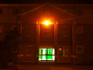
The other building I took photos of was the Lulworth building at college. This features in the third shot after the first title when the camera tracks around the two protagonists. I felt this would again create a good link to the film itself and would link the website front page to the trailer. The light on the front middle of the building distorted this photo and so I ruled this one out as well.

I also took each of these photos with the flash on in order to try and reduce the flare produced by the external lights on the buildings. This technique did reduce the flare however it also made the rest of the pictures too dark. This picture above is an example of how each of the photos taken with the flash on turned out.

This was the last position I took photos from on the evening. It is the main college building which is also in the first two photos but this time from close and directly in front. This took out the two lights at either end of the building. The lights on this building were not directly visible by the camera and so any distortion was small and in fact provided a very good effect for the top portion of the building.
I felt this photo was the most appropriate because it had good symmetry which thus balanced the shot. It also established the scene by showing the college at night. The photo is predominantly dark which matched my quota and the light was just enough to make the whole scene visible. The darkness works with the codes and conventions of a thriller and the college setting links it to our film. This should therefore attract our target audience and allow them to link the website to the other parts of our campaign.

The first photo I tried was of the main college building. This is the same shot as the one at the end of the opening shot for our trailer because of which I thought it may be appropriate. The problems I had in the end were the two lights on either end of the building flaring too much and distorting the image. I also decided the shot was too far from the building itself.

As a result I tried taking photos from closer. From this angle the light on the left side of the building still interfered. I could have cut it out on Photoshop but felt that would have left an imbalance on the page and so did not use this either.

The other building I took photos of was the Lulworth building at college. This features in the third shot after the first title when the camera tracks around the two protagonists. I felt this would again create a good link to the film itself and would link the website front page to the trailer. The light on the front middle of the building distorted this photo and so I ruled this one out as well.

I also took each of these photos with the flash on in order to try and reduce the flare produced by the external lights on the buildings. This technique did reduce the flare however it also made the rest of the pictures too dark. This picture above is an example of how each of the photos taken with the flash on turned out.

This was the last position I took photos from on the evening. It is the main college building which is also in the first two photos but this time from close and directly in front. This took out the two lights at either end of the building. The lights on this building were not directly visible by the camera and so any distortion was small and in fact provided a very good effect for the top portion of the building.
I felt this photo was the most appropriate because it had good symmetry which thus balanced the shot. It also established the scene by showing the college at night. The photo is predominantly dark which matched my quota and the light was just enough to make the whole scene visible. The darkness works with the codes and conventions of a thriller and the college setting links it to our film. This should therefore attract our target audience and allow them to link the website to the other parts of our campaign.
Location Photos from Recce
As part of the pre-production and planning stages for the trailer we carried out a recce in which we took photos of each loaction we were planning to use and drew floor plans of each location. This was done in order to help inform our storyboards and filming plans.
 This is the opening shot for the trailer. The camera will tilt down from the sky into an establishing shot of the college. This helps set the scene for the audience as the plinth in the bottom right corner of the picture clearly states it is a college.
 This is the second shot in which the two protagonists are introduced to the audience. They will be stood together in the courtyard and the camera will be tilted up at them slightly and will track around them. The outside setting merely sets the scene more clearly for the audience.
 This is again the courtyard but from the opposite angle showing some of what the camera will possibly see as it moves around the protagonists.

This is going to be a CCTV style shot of an empty classroom. This is both to further establish the college setting and also to give the audience the impression that the college is empty.
 At the end of this hallway we will show the lower half of the male protagonist’s body running from right to left. This is in order to give the audience the impression that he is running from ‘something’ (i.e. the protagonist).
 This will be another CCTV style shot in order to give the audience an objective view of the college setting. In this shot the male protagonist will run down the hall towards the camera again to promote the idea he is being chased. We chose this corridor because it is narrow enough to provide focus on the male protagonist as he runs down.
 From this position we will be taking two shots. The first will have the female protagonist in and the second won’t. Like many of the other locations the library establishes the college setting thus reinforcing this aspect in the minds of the audience.
 In this shot the camera will start just behind the wall and then look out from this position down the corridor at the back of the male protagonist. The camera will then move out into the corridor and go right up to the protagonist in a way that should infer the presence of another being (the antagonist).
 This is the same corridor and from this central position the camera will show the male protagonist turn around quickly as a reaction to ‘something’ coming up behind him.
This follows on from the last shot and shows the male protagonist after he has spun round. It will show that there is in fact nothing there just to add to the enigma and thus raise the tension in the minds of the audience.
 From this position the male protagonist will be shown coming through the door directly in front of the camera. The room will be dark and he will shine the torch around the room. The idea of this shot is to infer that he is looking for something but at this stage of the trailer the audience won’t know what.
 This room will again be pitch black apart from a lamp that will be strategically placed to give some light to the female protagonist who will be tied to a chair. All that will be shown in this shot is the female’s hands tied behind the back of the chair. The idea of integrating this shot with that of the male protagonist searching a room is to imply for the sake of the audience that he is searching for this girl.
 From this position the male protagonist will be shown coming through the door directly in front of the camera. The room will be dark and he will shine the torch around the room. The idea of this shot is to infer that he is looking for something but at this stage of the trailer the audience won’t know what.
 We will then cut back to the dark room where the girl is tied up. This shot will be an extreme close up of her eyes. It won’t last very long but will again work towards getting the audience to link the male protagonist searching the college and this person being held against their will.
 The next shot will be of the male protagonist jogging down the stairs beginning at the top of the flight in the top left corner of the screen and ending as he turns to go down the flight on the bottom right corner of the screen. Again this promotes the idea he is running and hence being chased in order to keep reinforcing the tension in the audience.
 This will be a point-of-view shot beginning from around 5-10 yards from the banister and then moving up to it and looking over the edge like the view on the left to see the male protagonist still making his way down the stairs. This will again reinforce the idea that another presence is there which is why the male protagonist is running as it is following him.
 In this shot the male protagonist will come through the door at the end and begin to run towards the camera. This is a further continuation of the chase.
 The male protagonist will then run past this gap from right to left and turn around to look behind him.
 There will then be a number of shots building up to the finale with the camera looking this way down the corridor. First the male protagonist will trip over in order to build the tension as he is losing time in the chase. He will then get up, try the door at the end only to find it’s locked. He will subsequently turn to face the camera and run towards the camera as the camera also tracks towards him like a point-of-view shot. These shots will be done with a variety of shot sizes and cuts to break them up.
 This is the opening shot for the trailer. The camera will tilt down from the sky into an establishing shot of the college. This helps set the scene for the audience as the plinth in the bottom right corner of the picture clearly states it is a college.
 This is the second shot in which the two protagonists are introduced to the audience. They will be stood together in the courtyard and the camera will be tilted up at them slightly and will track around them. The outside setting merely sets the scene more clearly for the audience.
 This is again the courtyard but from the opposite angle showing some of what the camera will possibly see as it moves around the protagonists.

This is going to be a CCTV style shot of an empty classroom. This is both to further establish the college setting and also to give the audience the impression that the college is empty.
 At the end of this hallway we will show the lower half of the male protagonist’s body running from right to left. This is in order to give the audience the impression that he is running from ‘something’ (i.e. the protagonist).
 This will be another CCTV style shot in order to give the audience an objective view of the college setting. In this shot the male protagonist will run down the hall towards the camera again to promote the idea he is being chased. We chose this corridor because it is narrow enough to provide focus on the male protagonist as he runs down.
 From this position we will be taking two shots. The first will have the female protagonist in and the second won’t. Like many of the other locations the library establishes the college setting thus reinforcing this aspect in the minds of the audience.
 In this shot the camera will start just behind the wall and then look out from this position down the corridor at the back of the male protagonist. The camera will then move out into the corridor and go right up to the protagonist in a way that should infer the presence of another being (the antagonist).
 This is the same corridor and from this central position the camera will show the male protagonist turn around quickly as a reaction to ‘something’ coming up behind him.This follows on from the last shot and shows the male protagonist after he has spun round. It will show that there is in fact nothing there just to add to the enigma and thus raise the tension in the minds of the audience.
 From this position the male protagonist will be shown coming through the door directly in front of the camera. The room will be dark and he will shine the torch around the room. The idea of this shot is to infer that he is looking for something but at this stage of the trailer the audience won’t know what.
 This room will again be pitch black apart from a lamp that will be strategically placed to give some light to the female protagonist who will be tied to a chair. All that will be shown in this shot is the female’s hands tied behind the back of the chair. The idea of integrating this shot with that of the male protagonist searching a room is to imply for the sake of the audience that he is searching for this girl.
 From this position the male protagonist will be shown coming through the door directly in front of the camera. The room will be dark and he will shine the torch around the room. The idea of this shot is to infer that he is looking for something but at this stage of the trailer the audience won’t know what.
 We will then cut back to the dark room where the girl is tied up. This shot will be an extreme close up of her eyes. It won’t last very long but will again work towards getting the audience to link the male protagonist searching the college and this person being held against their will.
 The next shot will be of the male protagonist jogging down the stairs beginning at the top of the flight in the top left corner of the screen and ending as he turns to go down the flight on the bottom right corner of the screen. Again this promotes the idea he is running and hence being chased in order to keep reinforcing the tension in the audience.
 This will be a point-of-view shot beginning from around 5-10 yards from the banister and then moving up to it and looking over the edge like the view on the left to see the male protagonist still making his way down the stairs. This will again reinforce the idea that another presence is there which is why the male protagonist is running as it is following him.
 In this shot the male protagonist will come through the door at the end and begin to run towards the camera. This is a further continuation of the chase.
 The male protagonist will then run past this gap from right to left and turn around to look behind him.
 There will then be a number of shots building up to the finale with the camera looking this way down the corridor. First the male protagonist will trip over in order to build the tension as he is losing time in the chase. He will then get up, try the door at the end only to find it’s locked. He will subsequently turn to face the camera and run towards the camera as the camera also tracks towards him like a point-of-view shot. These shots will be done with a variety of shot sizes and cuts to break them up.
Friday, 19 March 2010
Website Front Page Research
I carried out research into the websites of five current media products when I started the initial planning for my website front page. There has however been a significant period of time between this research and actually designing the page which is the point that I am at now. Due to this I have carried out further research into one new film ‘A Nightmare on Elm Street’ (Samuel Bayer, 2010) which is yet to be released and one film from my original research ‘Saw VI’ (Kevin Greutert, 2009) which has already been released. This is mainly in order to refresh my memory on the codes and conventions of movie websites and thriller film websites in particular. Now I am at the stage of actually planning to design my website front page I also have some more specific ideas about what I need to research.
Since my initial research some of the films whose websites I looked at have now been released and so their website front pages have changed and now focus on the DVD release. As my website front page is for a film which is yet to be released I felt it was essential that my main research focused on the website for a film that was also yet to be released which in this case is ‘A Nightmare on Elm Street’.
Textual Analysis
A Nightmare on Elm Street

The main thing I noticed both during this research and my previous research is that nearly all thriller website backgrounds were black. ‘A Nightmare on Elm Street’ uses a seemingly ‘more is less’ approach with their website. There is a clearly predominantly black background which is used to promote fear. The close-up of the lower part of the antagonist’s face and hand is the only direct visual reference from the film on the page. The colour scheme of this picture is very dark with just a mixture of black and a deep red. This colour scheme is used consistently throughout the website front page with the range of colours being limited to black, red, white and gray. I’d associate this strategy with the act of branding to an extent. In the same way that Cadbury’s just have to put purple in their adverts and everyone knows which company’s product it is advertising by using a set colour scheme throughout the audience will begin to associate the image of the antagonist and the black and red writing with the film.
There is one part of this website’s layout which seems to go against the normal codes and conventions which is that of the title being in the top right portion of the screen and the picture top left. This almost seems to show that the image of the antagonist is, as far as the producers of the film are concerned a more important part of the marketing of the film than the film’s title. Using the rule of thirds the most powerful place on the screen is the top left portion as we are trained to read a page from the top left to bottom right. Due to this most film’s place the film name in the top left section of the film as the name is generally the most important marketing tool.
The title uses the largest font size of any text on the screen emphasising its importance on the page. It is also consistent with the colour scheme of the website as it is red on the black background. By extending the red beyond the letters and spraying it around them it almost gives the effect of blood being splattered. As this is a thriller this was clearly an intentional act used to promote fear and the idea of pain as some of the main features of the film. By revealing this sort of detail about the narrative on the website they are more likely to attract their target audience and thus the website advertising could be deemed effective.
Another important feature to note not just about this website but all websites for films which are yet to be released is that the date is normally next to the title and is always very noticeable. This is a very important part of the marketing as if the public don’t know when the film is coming out this could cost the production company a great deal upon release due to reduced ticket sales.
The average size of a website page is approximately 800 x 600 pixels as this is the size of the average computer screen. Something I have noticed throughout my research however is that film websites are more like 800 x 1000 pixels. This extra space on the bottom of the page is used for the credits and legal blurb. For the actual advertising of the film this is the least important text on the screen which is why according to the rule of thirds it is placed at the bottom, and it is also why it is in the smallest writing, particularly the legal blurb. The font of the credits is a seemingly important feature of movie websites and in fact posters that have the credits. It is very thin writing in grey and includes the main people involved with the production including the actors and also the name of the film. This style is universal across all the film websites and seems to be an accepted convention of the film industry.
Saw IV

With regards to my research on ‘Saw VI’ most of it confirms that of ‘A Nightmare on Elm Street’. The colour scheme is very dark and the sizing and placing of the text is similar. The main extra details that I picked up from the Saw VI website was the use of links to social networking sites such as ‘Facebook’, ‘MySpace’ and ‘Twitter’ and also ‘YouTube’. This has become a common feature on movie websites recently as they understand the below-the-line marketing power these websites have. By making their own pages on them they get lots of free advertising which can only be a good thing when trying to promote a film.
Subscribe to:
Posts (Atom)
