The first photo I tried was of the main college building. This is the same shot as the one at the end of the opening shot for our trailer because of which I thought it may be appropriate. The problems I had in the end were the two lights on either end of the building flaring too much and distorting the image. I also decided the shot was too far from the building itself.

As a result I tried taking photos from closer. From this angle the light on the left side of the building still interfered. I could have cut it out on Photoshop but felt that would have left an imbalance on the page and so did not use this either.

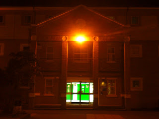
The other building I took photos of was the Lulworth building at college. This features in the third shot after the first title when the camera tracks around the two protagonists. I felt this would again create a good link to the film itself and would link the website front page to the trailer. The light on the front middle of the building distorted this photo and so I ruled this one out as well.

I also took each of these photos with the flash on in order to try and reduce the flare produced by the external lights on the buildings. This technique did reduce the flare however it also made the rest of the pictures too dark. This picture above is an example of how each of the photos taken with the flash on turned out.

This was the last position I took photos from on the evening. It is the main college building which is also in the first two photos but this time from close and directly in front. This took out the two lights at either end of the building. The lights on this building were not directly visible by the camera and so any distortion was small and in fact provided a very good effect for the top portion of the building.
I felt this photo was the most appropriate because it had good symmetry which thus balanced the shot. It also established the scene by showing the college at night. The photo is predominantly dark which matched my quota and the light was just enough to make the whole scene visible. The darkness works with the codes and conventions of a thriller and the college setting links it to our film. This should therefore attract our target audience and allow them to link the website to the other parts of our campaign.

No comments:
Post a Comment