Due to my previous Photoshop experience I had planned to take the photographs of my actors up against a white wall so that I could easily and quickly cut them out using the magic wand tool and then place them in front of a background of my choosing later.
 Due to my ‘Empire’ (Bauer Consumer Media) magazine research I got the actors to stand close to each other and look directly into the camera lens. This is because it is one of Empire’s conventions to get the cover model to look straight at the camera in order to promote an extra-diegetic gaze with the magazine consumers to hopefully get them to buy the magazine. I took several shots, some with them standing facing each other and some with them standing back-to-back. This was because in my two draft drawings for the magazine cover I had these two poses and hadn’t completely decided which I wanted to use at this time. I also took some photos with the flash on and some with the flash off in order to test which gave the best light levels and contrast (My decision making process as to which picture I finally used can be viewed here). The final picture I chose was with my two actors stood facing each other and looking at the camera. I decided that this promoted an ‘I’ve got your back’ feeling which is their relationship in the film.
Once the main picture for the front cover was sorted I then began to focus on the background. The background was a little less well planned than the main photograph. This is because there is no real generic background for Empire magazines. I had identified a few trends in the Empire covers and decided to test these. The beginning of this was the photos I had taken during the shooting of the trailer. I took some photographs of two of the main college buildings from different angles, both of which appear in the trailer at some point and so there was continuity in this idea.
 When I began to play with the idea on Photoshop I revisited the Empire magazine covers I had used in my research and realised that they generally don’t use a significant background from the film. In most the background seems to be part of a theme determined by the film being promoted on the cover in that issue. Such things as colour schemes and patterns would be linked in some way to the film. Once I had realised this I scrapped the idea of using a picture and began trying to design a background on Photoshop. (The results of this experimentation and how I got to my final background can be viewed here)
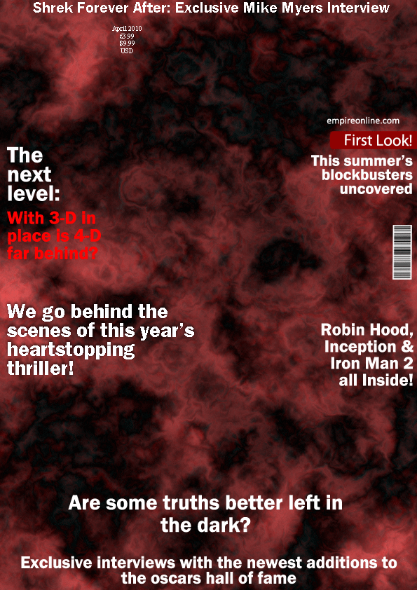
My final background was created by an effect on Photoshop called ‘difference clouds’. The idea of the cloud effect was that they promoted the idea of a storm and turmoil. I then made the clouds a mixture of black and red, and this decision was based purely on the codes and conventions of thrillers. Ideologically black is most associated with death, fear and the unknown whilst red is associated with blood and pain. Therefore at a subconscious level this background is promoting the idea of fear, pain and turmoil which is a big part of the film’s narrative and thus it should attract the target audience for the film.
Once the main imagery was complete I began to construct the rest of the magazine. I began with the title which in my case was ‘Empire’ as this is the magazine I had chosen to replicate (reasons for this choice can be viewed here). I recreated the title in the same font and colour as that on the real Empire magazines of this time. The title is probably the biggest part of Empire’s branding and so I had to make sure the title was the same in order to help make my cover as authentic as possible so that the consumer will be able to recognise the magazine as an issue of Empire.

After these two conventions of Empire’s the rest of the text I used is original. The first thing I included was the title of my film. This is a fairly customary practice as it is a major part of the branding of the film. Apart from the magazine title I made the film title the second largest piece of text on the page due to its importance in the marketing of the film. When I initially wrote my text on the page I used the font ‘Arial Black’ as it used block letters like Empire and gave a generally professional feel. I was later made aware however that Empire don’t use italics in 99% of cases and this particular font only came in italics, due to this I changed to ‘Franklin Gothic Demi’. This also had block letters but came in regular as well as italics. I differentiated my title from the rest of the text partially by its size but also by its colour and pattern. The red and black theme of the film was again used here to keep with the branding of the film.
 I placed it in the lower centre of the page as again this is a fairly commonly held convention of Empire’s. Once the film’s title was complete I placed my film’s tagline underneath in smaller plain white writing. This tagline appears in the trailer and on my website as well so it is an established part of the branding, though it is supposed to accompany rather than overpower the title hence the smaller more bland style of text.
The rest of the text on the page relates to other articles that would have been inside the magazine. I noticed that Empire usually include articles in films that will be released soon and other news relating to the movie industry. As such I did some research to find out what the major blockbusters of the summer were going to be and put a feature on them on the page. I also researched some of the hot topics in the movie industry at the moment and placed a title about what will come after 3-D and interviews with the oscar winners. Finally I wrote a heading for an interview with Mike Myers as the new Shrek film is being released this summer.

No comments:
Post a Comment