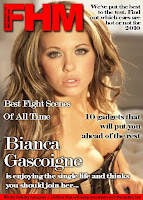
My preparation for the magazine stage of the coursework in fact began a few months ago now when my lecturer spent a few sessions with our class going through Photoshop. During the theory stage of the course when learning for the exam we had covered magazines a quite a bit of detail and so I had some reasonable knowledge on how it should be laid out and why. The idea of these sessions was mainly to build our Photoshop skills as much of our class including myself had never used it. During these seesions I created an FHM magazine cover from scratch.

Having the ability to use Photoshop is going to be invaluable at the production stage as it will allow me to create far more professional looking products. In fact one way this knowledge has already informed my plans for the production is that I have decided to take the photo I want of my actors up against a white wall so that I can easily cut them out by just using the magic wand tool. This will save a good deal of time and allow me to choose any background I want. This is the sort of knowledge I wouldn't have had without these early sessions.
Once the coursework had been officially set the first thing I did as part of my pre-production was research into current media products. I looked at both Empire and Sight & Sound which are two of the best selling movie magazines in Britain. I carried out a detailed textual analysis on each and tried to relate them to my film. I was considering who the target audience of each of these magazines was so that I could ascertain which magazine would most likely advertise my film and whose audience would most likely be interested in it.
After my initial research into each magazine and a textual analysis of a cover of each I decided Empire was the most appropriate magazine on which to advertise my film. They tend to advertise the more generic mainstream films compared to Sight & Sound which often focus on the more social realist type films. My group’s film idea was definitely more mainstream and as such I decided to base my advert on the Empire magazine format. I then carried out a more detailed textual analysis of Empire magazine covers by analysing another two of their covers. This research gave me a solid base from which to begin designing my cover. (link to empire research)
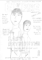
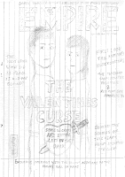
I drew a couple of first drafts with the characters facing different directions on the page to see which would look best.

 One of Empire’s conventions is that the main actor(s) of the film they’re promoting on the cover that week are stood prominently in the page and look directly at the camera lens. This acts like an extra-diegetic gaze in which the character seems to be directly addressing the person looking at the cover. According to Louis Althusser’s theory of ‘Interpellation’ this makes the viewer that the magazine is directly made for them at a subconscious level and they are more likely to buy it. I stuck with this convention closely as it is one of Empire’s most important.
Another thing I picked up from the textual analyses I did was that the extra articles Empire advertise alongside the main film promotion are always of relevant film topics and future releases. Due to this I spent some time researching current topics in the film industry such as what will replace 3-D cinema in the future and some adverts for summer releases this year. I felt it was necessary to put time into this research in order to make my magazine as authentic as possible by advertising articles Empire may actually use in their magazines.
After all this pre-production work was done I had a well planned draft page which I had drawn up. This meant that when I got to the production stage I could just get straight into it knowing that the product would be of good quality and matching Empire’s codes and conventions. It also meant I wouldn’t have to spend time messing around trying out lots of ideas because of poor planning which should lead to better efficiency.

No comments:
Post a Comment