Due to this I relied heavily on the research I had carried out during pre-production. On top of the initial research I had done a couple of months prior when it came to creating mine I needed to refresh my memory on the codes and conventions of thriller websites and so I analysed ‘A Nightmare on Elm Street’.
This textual analysis really helped inform my production and the main thing I learnt from it is that less is often more on thriller websites which was quite a relief on my part. This of course didn’t mean there wasn’t a large amount of thought that had to go into the design but it meant that there was less for me to have to coordinate.
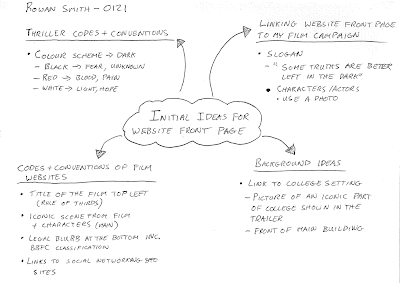
I used Photoshop to create my website front page on as this allowed for a great deal of creativity. I had some experience on Photoshop by this point as I had used to create my magazine cover and had taken part in tutorials with my lecturer on how to use it. This greatly advanced the standard of the product that I could produce and was a great help throughout the coursework. I started with the main image on the screen. From both my initial and secondary research it was clear that the websites usually use an iconic image from the film whether that be a place, person or object. Another of the most important features of a thriller website is that the colour scheme is very dark. So I had my initial direction for my main image and after some thought I decided that the front of the college building which appears in the first shot of the trailer is about as iconic a feature as there is that can be related to the film. It also links the website to the trailer in terms of the overall advertising campaign. Based on the thriller codes and conventions I also decided that it should feature the college building at night time.
 Once these decisions had been made I made plans to go in to college at 7:30pm on a Monday evening. The college is open until 8pm and they run evening classes until this time so I knew that there would be lights on around the college. I needed enough light to make the building visible whilst still being able to see the dark element. This was not an easy task as I don’t have any formal photography training and just had to use my own experience.Due to this fact I took quite a few photos from a number of different angles on the two main college buildings that appear in the trailer. This was in order to give myself the best possible chance of getting a photograph that I could use for my website. The main problem I faced with the photos was the outside lights on the building flaring on the lens and distorting some of the image. Another problem was the low light levels, which the camera was finding it hard to work with. The last shot I took on the evening was from directly
 in front of the main college building where all the lights were straight in front of me and most slightly hidden by pillars. This provided great lighting and ended up being the image I used on my website front page. (The decision process behind the we background image can be viewed here)
Once the main image had been chosen I then started looking at what else I should put on the page in terms of images. After viewing the ‘Twilight Saga: Eclipse’ website alongside ‘The Dark Knight’ website
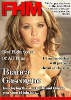
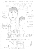
from my research I decided it would be appropriate to have the main characters on the page and ended up using the same image that I had used on my magazine cover. This worked towards further linking all the parts of the campaign together and showed continuity as the actors were in the same clothes as on the day of filming the trailer. I placed this at the bottom left corner of the background image just to show the characters’ connection with the location. The final image I used was the college sign.
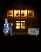 I cut this out of another photograph I had taken of the college building using the magic wand tool. As well as the surrounding background I also cut out the letters which left me with a sign that had a Halloween look to it and a haunting feel. This worked well as it acts as part of the branding of the film and alongside the dark colour scheme goes toward the overall ‘dark’ or ‘evil’ nature behind the film.
Once the images had been completed I began on the text. The main three pieces of text I planned on including were the film title, date of release and tagline. Originally I placed the film title in the most powerful place on the screen according to the rule of thirds, top left and in the largest font of any piece of text.
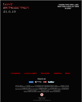
I then placed the release date immediately under it in the second largest font and finally the tagline of the top right corner of the canvas. These got the most powerful points on the page because they are such big elements of the branding of the film and will make the page recognisable to those who may already have been in contact with another part of the campaign.
With the images done there were a few pieces of text which I noticed were used quite often on film websites from my research. The first of these are the credits and legal blurb at the bottom. I modeled this on the example from the ‘A Nightmare on Elm Street’ website. I tried to recreate the style of writing that the credits are traditionally written in by narrowing the letters and the spacing between them by using the text settings on Photoshop and then made the font grey. This gave them the traditional look and conformed to the conventional credit style. I also placed the legal blurb at the bottom such as ‘privacy policy’, ‘terms of use’ and 15 classification icon. These are items which must be included by law but they are always placed near the bottom in small print as they are generally just considered formalities. Another section of text I had was for links to other parts of the website. Even though I’m not creating a working website for the coursework the front page must appear as it would if it was working and as such links to other pages such as character information, the synopsis etc, cannot be left off.


